
U.S Inflation graphic
If you haven’t seen it already, check out this amazing graphic of U.S inflation.
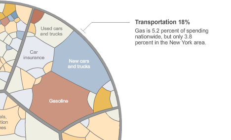
You can see what all the little sections are by hovering your mouse, or you can zoom right in.
It has lots of interesting little comparisons, although they’re all about the “average” person so I guess they might be lies, dam lies and statistics.
For example the average spending on new and used vehicles is 4.6% + 1.8% = 6.4%, whereas spending on car running costs, maintenance etc. is ~9%. For some reason I would have thought new cars would be a greater share of spending, but I guess running costs add up, and a lot of people drive old cars.
Posted by mike on Tuesday May 6th, 2008