
All mocked up
These GUI mockups by some guys working on the “Symphony OS” (which is just a Linux distro it seems) are really cool.
Although I love KDE, I really don’t think you can argue that the default desktop layout is optimal or even well thought out. It looks like Windows, which might be useful for some people, but there’s lots of lost oportunities to actually do better than Windows.
The default GNOME layout is a bit better, it makes better use of Fitt’s Law by putting the task bar along the bottom of the screen. Although I still can’t get my head around spatial Nautilus.
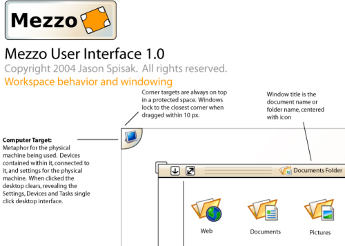
The SymphonyOS mockups make a lot of sense. Using the corners as targets is so obviously a good thing.
I don’t think the Trash is worth an entire corner, I’d put it under documents, and use that corner for something more useful.
I also don’t think Logout and Shutdown should be in the Computer section. It lures inexperienced users into a corner they otherwise might best avoid.
It’d also be interesting to see how well it all scales, ie. how does it look when you’ve got 15 windows open. But if they can get half of it implemented I’ll be very interested.
Posted by mike on Tuesday May 31st, 2005, tagged with linux, nerd